


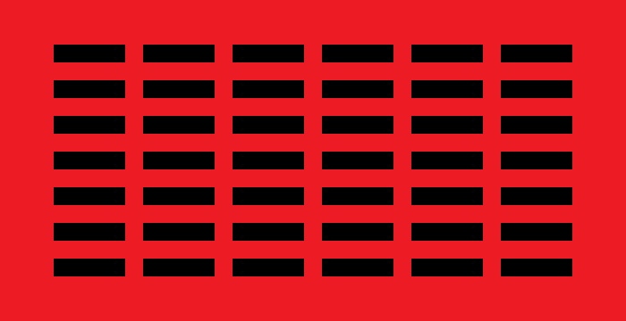
 Every movement needs symbols, and the sortition movement is notably short on them. I’ve taken the liberty of putting together a couple! The design is a stylised version of the kleroterion – a 6×7 grid of 42 horizontal bars (because sortition is the answer!) The bars are 2×8 units, separated by gaps of 2 units from each other; the top and bottom borders are 9 units high, and the right and left borders are 12 units across, giving the flag as a whole a 2:1 aspect ratio.
As well as representing the kleroterion, the flag also resembles a swarm of ‘=’ signs. The mass of bars – more than can be counted in a casual glance – suggests the mass of people sortition is meant to empower and the mass of centres between which it aims to separate powers. Aesthetically, it turns the design into a texture, unique to the sortitionist flags.
 I’ve done two colour variants – a red-and-black one for left-sortitionism, and a blue-and-white one for centrist/right-sortitionism. As I see it, the dividing line between the two is that left-sortitionism sees the conflict between power elites and the public as extending into the economic sphere, and believes sortitional-democratic mechanisms are the best or only way to achieve lasting victory for the latter, while centre- and right-sortitionism are concerned more narrowly with political power within a capitalist market economy. Where we agree is on the importance and legitimacy of sortitional-democratic mechanisms in government. By having multiple flags riffing on the same theme, we provide a template for a symbolic shorthand for sortitionism that can be used by other people – green sortitionists, anarcho-syndicalist sortitionists, and so on – thereby helping spread familiarity with the idea.
You can see an animated version of the left-sortitionist flag here.
Filed under: Sortition | Tagged: flags, sortition, sortition movement, symbology | 22 Comments »
